The Spatial Way

By Colin Charles, <byte@aeon.com.my>, http://www.bytebot.net/
Last Updated: Wed May 19 03:25:48 EST 2004

Much has been said, and been discussed about "spatial views". Ever since the GNOME hackers decided that Nautilus, the file manager in GNOME, would sport a spatial way of working by default, the word "spatial" has been in just about every other mailing list or review of the desktop environment. Note that I don't claim to be a usability expert, but I'd like to point out the vast resources on spatial usage, as well as show how GNOME 2.6 actually makes you more productive. My base system is Fedora Core 2, with GNOME 2.6.0 (so screenshots come by default, with the BlueCurve theme).

BlueCurve based GNOME 2.6 iconsA GNOME 2.6 based desktop will have the standard icons as there on the left:
  1. Computer, to browse your entire system (CDROM, floppy, disks, networks)
  2. The user's home directory
  3. The trash can
  4. Start Here, for applications and desktop preferences - easy access to the configuration tools
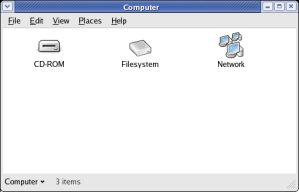
Computer viewClicking on any icon, brings up Nautilus, in its new spatial view.

So double-clicking the Computer icon, brings up devices that are attached to my system - being a laptop that I write this on, with a hot-pluggable floppy drive, it shows the CD-ROM drive, the Network that I can access, and provides full access to my Filesystem (/).

This sort of view is known as the Object Oriented (OO) metaphor, while previous versions of Nautilus defaulted to the Navigation metaphor. The OO metaphor, after long debates, seem to be the easier of the two, for new users to learn how to use - it abstracts the need to understand the filesystem and allows for the concept of directories to be understood better. (read more about the OO metaphor versus the Navigation metaphor)

Table 1: Comparison between spatial (OO metaphor) and non-spatial (navigational metaphor) browsing
Spatial Windows
Non-spatial window viewing
Object Oriented Metaphor
Navigational Metaphor

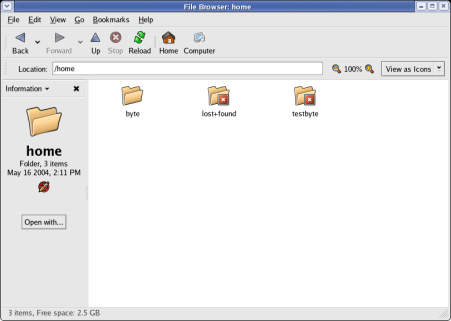
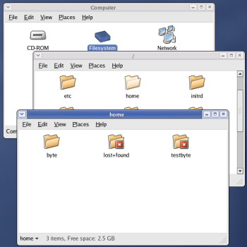
Browse folderAn example of browsing from the filesystem onwards, to the home directories, would be like the screenshot on the left (in Table 1). It is a clear example of how windows are expected to look and behave, rather than the old way of just continuing on the browsing (on the right, in Table 1). The Navigational metaphor still exists in GNOME 2.6 - instead of double-clicking on the folder, you can right-click, and select Browse Folder, and it brings up the old Nautilus view.

Lighter icons are good user feedbackThe UI designers also paid a lot of attention to making it very user-friendly - when a folder has been opened (i.e. a new window has been created for it), the icon changes state (becomes a little dimmer/lighter), and this is useful feedback for the user. In the example, on the left, notice that the "python" and "rpm" folders have already been opened, and their icons are significantly dimmed, in comparison with the "evolution" folder.

Such feedback is just genius, and even if you do not notice it and click on say, the "rpm" folder again, it would just bring to focus, the window that has already been opened. It should also be made clear that this is known to be theme dependant.

Focusing on a window

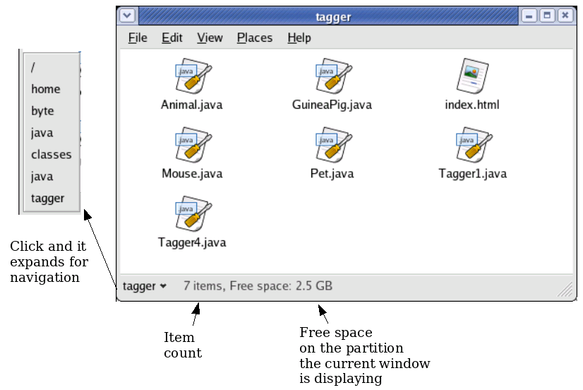
Focusing on a Window itself
By clicking the bottom-left bit, you can navigate the file hierarchy quite well (it goes from current directory, all the way to the root directory). So in the example above, tagger is the current folder that's open - before that its java, and so on (the path is /home/byte/java/classes/java/tagger). Plus, there are keyboard shortcuts to make this easier - Alt+Up arrow helps traverse up the tree.

Useful shortcuts

Everyone likes little tips and tricks that make their life easier, so here are some:

Don't like it

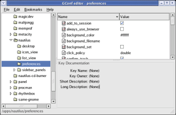
GConf: No more spatial viewsThen remove it! Using GConf (Fedora -> System Tools -> Configuration Editor) and go to the /apps/nautilus/preferences key. You can then apply a tick alongside the always_use_browser key. Log out of GNOME, and upon re-logging in, your new changes would take effect.

It can also be performed on the command line via the gconftool-2, by starting a terminal session (right-click the desktop, then click Open Terminal), and entering: gconftool-2 --type boolean --set /apps/nautilus/preferences/always_use_browser true.

It's also interesting to note that newer releases of Nautilus will have this available as an option in the Preferences (Edit -> Preferences) dialog - but currently, your only way is to make an edit within GConf itself.
So why spatial? (conclusion)

A lot of reference is placed to an article by John Siracusa, on ArsTechnica, where he analysed the Mac Finder, and stated with a good study, as to why the Finder that was on all Macs before OS X was definitely better for users (yes, OS X currently does not provide spatial views by default; you're required to hit a key before clicking before it be comes spatial). In the article, he provides examples as to why we're spatially oriented human beings - and why coherency is important in a UI.

It sticks to the fact that people associate better with the computer's interface when they know that files and folders seem real, just like their physical equivalents, where you "could manipulate in familiar, direct and predictable ways." So, the spatial interface is supposed to be better, because it helps mimic real life - this makes associations easier and better for the user.

GNOME has done something ground-breaking by doing away with the browser-styled, Navigation metaphor, as a default. Everytime the contents changes within a window, people get lost, and file navigation becomes harder. So "folders" are "windows", now, and this implies:
So rather than posting to the mailing lists, or writing factually incorrect articles, it seems that the time has come to move on from the fact that Nautilus by default, has become spatial. The GNOME Desktop has started breaking down the myth of the "average user" and the "power user"  and instead focusing on "good defaults and elegant interface design makes software better for everyone to use, regardless of their level of experience", and drastic changes like this is only going to push the open source desktop further.

References

  1. Alexander Larsson: The future direction of the Nautilus UI - 4th September 2002
  2. Steven Garrity: The Rise of Interface Elegance in Open Source Software - 26th April 2004
  3. John Siracusa: About the Finder... -
  4. Manuel Amador: Re: GNOME 2.6: What were you thinking? - 13th May 2004

Thanks

Goes out to Kjartan Maraas, Murray Cumming and Jason Tackaberry for additions to the document.

bytebot.net | Geek Docs

Colin Charles <byte@aeon.com.my>, © 1996-2004